Mostly referred to as that "other" major social networking site besides Facebook and Twitter, Google+ has managed to stay relevant and innovative while only being on the social media scene for two years.
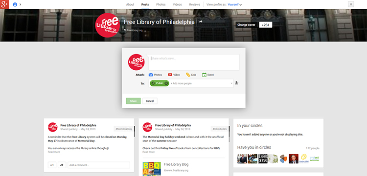
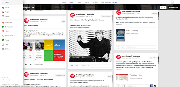
On May 15th, Google+ rolled out a major redesign, first for desktops and then a week later for mobile devices. The redesign showcases a multi-column layout for its main news stream. Built with responsive web design in mind, the layout adapts to the screen resolution and size of the device you are using. Certain types of media, like large photos and videos, have been given more prominence on the desktop by making them stretch the full width of the screen. Other new features include auto-generated hashtags and auto enhance filter for photos.


You can find a lot of the same great content and information we supply for our other social media sites on our Google+ page, but we also lean more towards science, technology, and pop-culture-related posts there as well.
Check out Free Library of Philadelphia on Google+!
Have a question for Free Library staff? Please submit it to our Ask a Librarian page and receive a response within two business days.
