We’re taking a break from our normal book reviews to look at our historical collections at the Free Library. The Children’s Literature Research Collection (CLRC) houses premier examples of children’s literature from the 1860s through the present.CLRC’s Curator, Christopher Brown, examines one of the titles, Aliki’s My Five Senses.
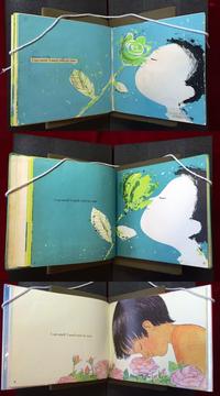
Published in 1962, Aliki’s My Five Senses is still used today by educators and parents because the concepts are highly informative and the language is easily understood by preschoolers and kindergarteners. In 1989, HarperCollins reissued the book with new illustrations by Aliki. The original illustrations were created in bright colors and bold graphics that were iconic to the time period. The 1989 illustrations are softer and more realistic. Looking at the pictures, which version do you prefer?
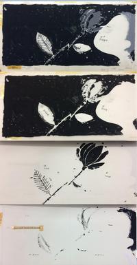
Aliki gifted the final art, color separations, and her original dummy book for the 1962 My Five Senses to the Free Library of Philadelphia. We archivally store the pieces so that they are available to be used by researchers, historians, and curious members of the public for generations to come.
The final art are the spreads used to print the book. Each layer of color is inked onto acetate sheets in black. When printing, the black will be replaced by each color. The colors will layer to create the final image in the book. There are three acetate sheets used to create the image of the boy and flower.
A dummy book is created by an artist or author to see how a book will look when it is created. Dummies are used to see how text will look on a page and if items need to be moved or eliminated. Aliki created this dummy with acrylic paint, conte crayons, pen and ink, and paper.
Would you like to see the artwork in person? Contact the Children’s Literature Research Collection to view our collections!
Have a question for Free Library staff? Please submit it to our Ask a Librarian page and receive a response within two business days.


