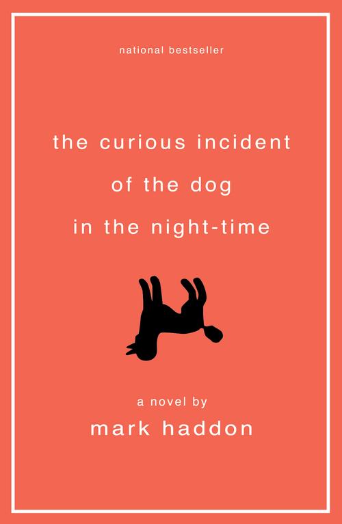
This year's One Book, One Philadelphia selection has a bright cover you just can't miss. It's hard to even think of The Curious Incident of the Dog in the Night-Time without the upside-down dog on the cover coming to mind.
The cover was designed by Michael Ian Kaye, the creative director and partner of the design and advertising firm Mother New York. The Free Library was able to ask Michael about the story behind the cover. According to Michael, he wanted to keep the design simple because "the title has such magic." Read on to learn more about Michael's design process and this iconic cover!
How did you get involved in designing book covers?
My first job was administrative assistant to the design director of Penguin Books, who led the design of all book interiors. My early design work was fixing typos to the pages of novels and nonfiction books. Eventually, I got the opportunity to design book interiors and while I was doing that, I received an opportunity to design the cover of a book called Camel Lot by Moselle Schaffer after the initial cover design got killed.
How did you specifically get the job to design The Curious Incident of the Dog in the Night-Time cover?
At that point, I had built a name for myself as a book jacket designer. Not sure if it was an author or editor request, but Curious Incident was a freelance project.
How did you conceive of the cover design?
Something in the tone of the writing felt super literary, and something in the arch of the story had humor and imagination—I wanted to convey both of these. Similarly, I wanted to use the upside down dog (a standard poodle) as both a metaphor for Asperger's and seeing the world differently, but also how the death of the dog incites all of the action of the novel.
Tell me about the process of creating the cover. Did you talk to the publisher or the author during the process?
Sometimes you just have a feeling, and I knew that this was Mark Haddon’s first novel for adults and was a breakout book. There was an intuitive sense that creating something that was both quiet and bold—so quiet in its literary approach, and bold in its color and use of the graphic poodle—would be impactful and serve the marketing approach around the book. It was really well received throughout the design process.
Did you read the book? How do you see your cover design as continuing—or augmenting—the story?
I read the manuscript. And when reading manuscripts to design covers, I’m always looking for a moment or an icon, a symbol, an action, or a feeling that can serve as a representation of the content and author’s intent. And at the same time, it needs to feel contemporary and relevant so that it does its job in a bookstore environment. When I think back on all of the things that I’ve designed, this particular design has a unique spot in my heart because of the significance of the book from a literary standpoint, and the simple approach to storytelling that the cover design lends itself to.
How did you settle on the color of the book?
I knew that the book felt quiet but that this was not a somber, black and white story. There was something optimistic and intelligent about Christopher as a character, and that his innocence had a brightness too, which is how I settled on the color.
**Check back every #OneBookWednesday during the Reading Period for some more One Book food-for-thought!**

Have a question for Free Library staff? Please submit it to our Ask a Librarian page and receive a response within two business days.